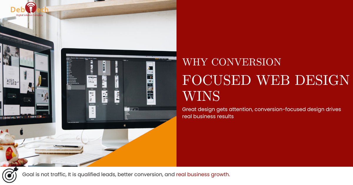
Why Conversion Focused Web Design Wins
A website can look polished, load fast, and still fail at the one job that matters most - turning attention into action. That is the gap conversion focused web design is built to close. It treats your site as a sales asset, not a digital brochure, and it measures success by leads, booked calls, form submissions, purchases, and qualified pipeline.
For business owners and marketing leaders, this distinction matters more than most agencies admit. Traffic alone does not create revenue. Rankings alone do not create revenue. Even strong ad performance can break down if the page experience is weak. If users land on your site and hesitate, get confused, or fail to trust what they see, your acquisition spend starts leaking immediately.
What conversion focused web design actually means
Conversion focused web design is the practice of building pages around a defined business outcome. That outcome might be a quote request, demo booking, phone call, online purchase, or application. Every design decision supports that objective, from page structure and copy hierarchy to mobile usability and form length.
This is where many websites miss the mark. They are designed around internal preferences instead of buyer behavior. The homepage tries to say everything. Navigation gets overloaded. Calls to action compete with each other. Visual choices are made for style, not clarity. The result is a site that looks active but performs passively.
A conversion-focused site works differently. It reduces friction. It answers the next question before the visitor has to ask it. It shows proof at the right moment. It guides attention with purpose. Good design still matters, but design is serving momentum, not decoration.
Why businesses lose conversions on otherwise decent websites
Most underperforming websites do not fail because of one dramatic flaw. They fail because of a stack of smaller issues that interrupt buyer confidence.
Sometimes the offer is unclear. A visitor lands on the page and cannot tell within five seconds what the company does, who it serves, or what to do next. Sometimes the page is technically sound but overloaded with choices, which creates hesitation instead of action. Sometimes the messaging is generic, so users do not see a reason to trust the company over any other option in the market.
Mobile is another common point of failure. A site may look fine on desktop but force mobile users to pinch, scroll, wait, or hunt for the contact button. For local service providers and growth-stage businesses, that is not a minor usability issue. It directly affects lead volume.
Then there is the disconnect between channels. Paid ads may promise one thing, search visitors may expect another, and the landing page may speak in vague brand language that satisfies neither. If traffic sources and page intent are misaligned, conversions drop even when traffic volume rises.
The core elements of conversion focused web design
Clear message first, visuals second
Visitors do not start by admiring your layout. They start by scanning for relevance. Your headline, supporting copy, and primary call to action need to explain the value quickly. What problem do you solve? Who is it for? What should the visitor do next?
Strong visuals help reinforce that message, but they should not compete with it. If the page looks premium yet the offer is vague, users still bounce. This is why conversion work often starts with messaging strategy, not just wireframes.
A page structure built around decision-making
High-converting pages are usually simple in appearance and deliberate in flow. They move from relevance to credibility to action. That might mean leading with a direct value proposition, following with proof points, then addressing objections, and only then asking for the conversion.
The exact sequence depends on the audience. A low-commitment offer like a consultation request may need less persuasion than an enterprise inquiry form. An ecommerce page needs different support than a local service landing page. The principle stays the same: structure should match how the buyer evaluates risk.
Friction reduction at every step
Every extra field, unclear button, slow asset, or distracting pop-up creates friction. Not all friction is bad. Some businesses need qualification steps to protect sales time or filter out poor-fit leads. But unnecessary friction kills momentum.
The better approach is to be selective. Ask only for what the next step requires. Keep forms readable. Make tap targets obvious on mobile. Place calls to action where intent is highest. Friction should come from business strategy, not sloppy execution.
Trust signals that support the sale
Trust is not built with one testimonial block slapped near the footer. It is built through consistency and specificity. That includes real proof of outcomes, visible expertise, clean branding, accurate content, secure site performance, and a professional user experience from first click to final form submission.
For many buyers, especially in competitive service categories, trust signals are what separate interest from inquiry. Certifications, case results, partner logos, review patterns, and industry-specific experience all matter. But they need context. Proof works best when it appears exactly where the user starts wondering, Can this company actually deliver?
Conversion focused web design and SEO should work together
Too many businesses treat website design and SEO as separate projects. That creates avoidable performance issues. A visually strong site that ignores search intent may struggle to attract qualified traffic. An SEO-led site with weak UX may rank but fail to convert.
The better model is integration. Search data tells you what users want, how they phrase problems, and which pages deserve dedicated intent matching. Design then turns that insight into a cleaner path to conversion. When these functions work together, your site does more than attract visitors. It converts the right visitors.
This matters even more for local and regional businesses. If a company is trying to capture demand in competitive markets like Northern Virginia, page clarity, location relevance, and mobile usability all influence whether a user calls, books, or leaves. Search visibility gets you into the consideration set. Conversion strategy helps you win from there.
What good conversion-focused design looks like in practice
A strong service page does not bury the offer under brand slogans. It opens with a specific promise, makes the next step obvious, and supports that claim with proof. It answers practical questions before the user has to click around. It avoids clutter and keeps the page moving toward action.
A strong landing page goes even further. It strips away distractions that are useful on a full website but harmful in a campaign environment. If the goal is demo requests from paid traffic, then the page should stay tightly aligned with the ad, speak to one audience, and guide users toward one clear action.
A strong homepage has a different job. It needs to orient multiple types of visitors without becoming a traffic jam. That usually means presenting the business clearly, segmenting pathways intelligently, and making high-intent actions easy to find.
In all three cases, the common thread is discipline. Not every page needs every feature. Not every stakeholder opinion belongs on the screen. Conversion performance improves when pages are designed for the user decision in front of them.
The trade-offs business leaders should understand
Conversion focused web design is not about making every page minimal or aggressive. There are trade-offs.
A more direct page can improve lead volume, but if qualification is too loose, sales teams may get flooded with weak inquiries. A shorter form may lift submissions, but it may also reduce lead quality depending on the service. More proof can increase confidence, but too much content can slow down decision-making if the page loses focus.
That is why smart conversion work depends on context. Buyer intent, sales cycle length, traffic source, service complexity, and internal follow-up capacity all shape the right design choices. The goal is not to chase generic best practices. The goal is to build a site that supports how your business actually closes business.
How to evaluate whether your website is conversion focused
Start with a hard question: can a first-time visitor understand your value and next step almost immediately? If not, your site likely has a conversion problem before it has a traffic problem.
Then review the journey page by page. Are your calls to action consistent? Does each important page have one dominant objective? Is the mobile experience as strong as desktop? Are trust signals placed where users need reassurance? Do your service pages match the intent of the traffic they receive?
Next, look beyond surface metrics. High traffic and low conversion often point to message mismatch, weak offers, or UX friction. Short sessions are not always bad, especially on pages built to drive a direct call or form fill. What matters is whether the right users are completing the right actions.
That is the standard Debtech applies when evaluating digital performance. The website is not treated as an isolated design project. It is part of a larger growth system that includes search visibility, paid traffic, mobile experience, and lead flow accountability.
A website should make your marketing more efficient, not force every other channel to work harder. If your traffic is arriving but your pipeline is not improving, the problem may not be reach. It may be that your website has never been designed to convert. Fix that, and the rest of your digital investment starts working like it should.