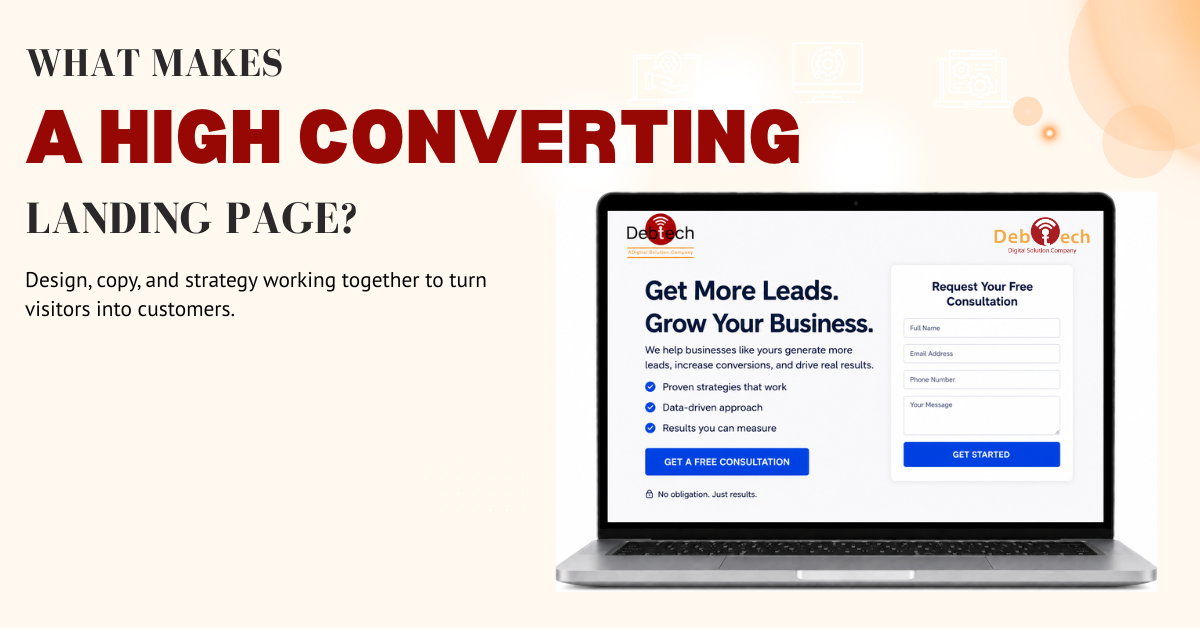
What Makes a High Converting Landing Page?
Most landing pages do not fail because the design looks bad. They fail because they ask visitors to do too much, think too hard, or trust too quickly. If you are trying to understand what makes a high converting landing page, the answer is not one trick or one design trend. It is alignment - between the ad, the offer, the message, the page structure, and the action you want the visitor to take.
That matters because a landing page is not a homepage. It is not there to tell your whole brand story or showcase every service your business offers. Its job is narrower and more valuable than that. It needs to move a specific audience toward a specific next step with as little friction as possible.
What makes a high converting landing page work
A high converting landing page works because it removes uncertainty. Visitors arrive with a question in mind, even if they do not phrase it that way. They want to know whether they are in the right place, whether this offer fits their problem, whether they can trust the business, and whether taking action is worth their time.
Strong pages answer those questions fast. Usually that starts above the fold, where the headline, supporting copy, visual hierarchy, and call to action need to work together. If the headline is vague, the offer is buried, or the button text is weak, conversion rates suffer before the visitor even scrolls.
This is where many businesses lose momentum. They spend heavily on traffic through paid ads, SEO, email, or social campaigns, then send that traffic to a page that feels generic. The page may be technically functional, but it is not conversion-focused. Those are two different standards.
Message match comes before design polish
One of the clearest signals of what makes a high converting landing page is message match. The promise that brought the user in must be the same promise they see on the page. If someone clicks an ad about booking a demo, downloading a guide, or getting a service quote, the landing page should reinforce that exact action and outcome.
When message match is weak, bounce rates rise. Visitors feel a disconnect, even if they cannot explain why. That disconnect might come from a different headline, a different offer, or a page that suddenly shifts into broad company messaging instead of staying focused on the conversion goal.
Design still matters, but mostly as a delivery system for clarity. Clean layout, spacing, typography, mobile responsiveness, and visual contrast all support the message. They are not the message. A beautiful page with weak positioning often underperforms a simpler page with sharper copy and stronger intent alignment.
The headline has one job
The headline should communicate value immediately. Not cleverness. Not brand personality for its own sake. Value.
In practice, that means the headline should tell the visitor what they get or what problem gets solved. The supporting text can add context, reduce hesitation, or clarify who the offer is for. Together, they should create a quick, confident path into the page.
This is where specificity pays off. A headline that says "Grow your business online" is broad and forgettable. A headline that makes the offer concrete is usually stronger because it reduces interpretation. High-converting landing pages do not make the user guess.
There is a trade-off here. If you make the headline too narrow, you may reduce relevance for adjacent audiences. If you make it too broad, you lose urgency and clarity. The right balance depends on traffic source, audience intent, and how targeted the offer is.
A focused call to action beats too many options
Every landing page needs a primary conversion goal. That could be a form submission, consultation request, demo booking, phone call, or download. What hurts performance is trying to force several competing goals onto one page.
The more choices you add, the more hesitation you create. Navigation menus, multiple competing buttons, unrelated offers, and excessive internal pathways all pull attention away from the action that matters most.
High converting pages usually keep the call to action visible, clear, and repeated at logical points. The wording should reflect the value of the action. "Submit" is technically accurate, but it does not reinforce what the user gets. Better CTA copy tends to be more direct and outcome-oriented.
That does not mean every page should be stripped down to the point of feeling empty. Some offers need more explanation before a visitor is ready to act. The key is to support the primary action, not distract from it.
Trust is not a bonus element
Trust is one of the most overlooked parts of conversion performance. Businesses often focus on layout and traffic volume while ignoring the simple fact that most visitors are skeptical by default.
A high converting landing page lowers that skepticism with evidence. Testimonials, reviews, certifications, recognizable client logos, case-study proof points, industry experience, and clear business identity all help. So do small signals that are easy to miss, like professional design, consistent branding, accurate grammar, and a form that does not ask for excessive information.
The type of trust signal should match the audience. A local service business might benefit most from location-specific reviews and proof of responsiveness. A B2B company may need stronger operational credibility, process clarity, or examples of measurable outcomes. Government-adjacent and procurement-conscious buyers may look for certifications and execution reliability more than emotional persuasion.
Trust also connects to transparency. If the offer is unclear, the timeline is vague, or the form feels invasive, visitors hesitate. People convert when they understand what happens next.
Good landing pages reduce friction at every step
Friction can come from obvious problems like slow load times or broken mobile layouts. It can also come from subtler issues, such as long paragraphs, weak hierarchy, too many form fields, or a page structure that forces users to hunt for the next step.
Mobile performance deserves special attention. In many campaigns, the majority of visitors arrive on a phone, not a desktop. If the page is hard to scan, buttons are awkwardly placed, or the form is frustrating on mobile, conversions drop quickly. A mobile-first landing page is not just a resized desktop design. It is a page built around smaller screens, faster decisions, and shorter attention windows.
Form strategy is another common friction point. More fields may help qualify leads, but they can also reduce total submissions. Fewer fields may increase volume but lower lead quality. The right approach depends on your sales process, follow-up speed, and how much intent exists before the click. There is no universal form length that wins every time.
Structure should follow buyer intent
A landing page should be built around how much conviction the visitor already has. Warm traffic from branded search or remarketing usually needs less education. Cold traffic from paid social often needs more context, stronger trust signals, and more objection handling.
That is why high converting pages are structured with intent in mind. Some pages need a short path: headline, proof, CTA. Others need a fuller sequence: problem, solution, benefits, proof, objections, then CTA. If you skip the middle steps for a skeptical audience, conversion rates suffer. If you overexplain to ready-to-buy traffic, you slow them down.
This is one reason integrated strategy matters. Landing page performance is tied to the campaign feeding it. The best page for SEO traffic may not be the best page for PPC. The best page for local lead generation may not be the right one for enterprise outreach. Businesses that treat landing pages as isolated design projects usually leave conversion gains on the table.
Testing is part of what makes a high converting landing page
No serious landing page strategy ends at launch. If you want to know what makes a high converting landing page over time, testing is part of the answer.
That does not mean changing everything at once. Effective testing is controlled and tied to a clear hypothesis. You might test headline variations, CTA copy, form length, page layout, proof placement, or offer framing. The goal is to identify what actually improves conversion behavior, not just what looks better in a review meeting.
Not every test will produce a dramatic lift. Some changes move results meaningfully. Others do almost nothing. The point is to build a page through data, not assumptions.
Quality measurement matters here too. A page that increases leads but lowers lead quality is not necessarily a win. Conversion rate, cost per lead, sales acceptance, and downstream revenue all belong in the conversation. Execution-focused teams look beyond the form fill.
The best landing pages feel decisive
A high converting landing page feels like it was built for one audience, one offer, and one outcome. It speaks clearly. It loads fast. It earns trust. It keeps the next step obvious.
That level of performance rarely comes from design in isolation. It comes from strategy, copy, UX, technical execution, and channel alignment working together. That is why landing pages often become the clearest test of whether a business is running disconnected tactics or an actual growth system.
If your traffic is solid but conversions are inconsistent, the page is usually telling you where the gap is. The right response is not to add more noise. It is to make the decision easier for the person on the other side of the screen.