
How to Improve Website Conversions That Matter
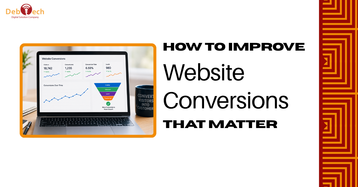
A website can attract thousands of visitors and still fail its core job: creating qualified calls, form submissions, purchases, or demo requests. Learning how to improve website conversions is not about adding more buttons or redesigning pages based on opinion. It is about finding the friction between a visitor's intent and the action your business needs them to take.
For a local service business, that action may be a booked consultation. For a B2B company, it may be a high-quality lead that sales can contact quickly. For an eCommerce brand, it is a completed order. The conversion strategy should match that outcome, because a higher volume of weak leads is not the same as growth.
Start With the Conversion, Not the Design
Many websites are built around internal priorities: a long company history, a list of capabilities, or a homepage designed to please every audience at once. Visitors arrive with a much simpler question: can this business solve my problem, and what should I do next?
Define one primary conversion for every high-value page. A paid search landing page should not ask visitors to browse six service categories, join a newsletter, download a brochure, and call an office. It should support the next logical step for the campaign that brought them there.
Secondary actions can still have a place. Someone not ready to request a consultation may want to review case examples or read answers to common questions. But those actions should support the primary decision, not compete with it.
A useful starting point is to separate conversions into three levels. Primary conversions directly create revenue opportunities, such as purchases, quote requests, scheduled meetings, and phone calls. Assisted conversions show engagement, such as viewing key service pages or starting a form. Diagnostic events, such as button clicks and form errors, reveal where the experience is breaking down. Measuring all three makes optimization far more precise.
Make the Offer Clear in Five Seconds
Visitors do not read a website in a neat top-to-bottom sequence. They scan. If the first screen is vague, overloaded, or focused on generic claims, they leave before the rest of the page can make its case.
Your headline should state what you do, who it is for, and why the visitor should care. “Innovative solutions for a better future” sounds polished but says nothing useful. A stronger message names the business result: conversion-focused website development for companies that need more qualified leads, faster sales cycles, or stronger local visibility.
Support the headline with a short explanation of the specific value you provide. Then give visitors a clear action. “Get a Free Strategy Call” is more direct than “Learn More” when the page is built to generate consultations. The right wording depends on the commitment you are asking for. A complex service with a long sales cycle may need a lower-friction offer, while a repeat customer may be ready to buy immediately.
Avoid treating every visitor as equally informed. First-time visitors need context and confidence. Returning visitors may need proof, a comparison, or an easy way to contact your team. Good conversion pages anticipate both without becoming cluttered.
Remove Mobile Friction Before Buying More Traffic
Mobile usability is often where conversion budgets are lost. A page can look excellent on a desktop monitor and still be difficult to use on a phone: cramped text, tap targets that are too small, slow images, broken forms, or a call-to-action buried below several sections of content.
Review your highest-traffic pages on real phones, not only in a browser preview. Can a visitor understand the offer without pinching or zooming? Can they call, request service, or complete a form with one hand? Does the navigation help them move forward, or does it send them into a maze of choices?
Speed matters for the same reason. Every extra second gives a visitor another chance to abandon the page, especially when they arrived from a paid ad or a local search result with an immediate need. Large uncompressed images, excessive scripts, auto-playing media, and poorly configured plugins can all damage performance.
The answer is not to strip every page down to bare text. Visual proof, product imagery, and video can strengthen a decision. The trade-off is to use them intentionally, compress assets properly, and prioritize the content that helps a prospect act.
Build Trust Where Decisions Happen
A visitor may like your offer and still hesitate because the risk feels unclear. They want evidence that your business is legitimate, capable, and responsive. Trust signals work best when they appear close to the point of decision rather than hidden on a separate page.
For service businesses, relevant proof may include concise client outcomes, industry experience, certifications, recognizable project types, review themes, and a clear explanation of what happens after someone contacts you. For eCommerce, it can include accurate product details, clear shipping expectations, customer feedback, and straightforward return information.
Specificity carries more weight than generic praise. “Great company” is pleasant but weak. A testimonial that explains the problem, the work completed, and the result gives a prospect something they can evaluate. The same principle applies to case studies. Focus on the business challenge and measurable progress, not a gallery of attractive screens without context.
Trust also comes from consistency. If an ad promises a free assessment, the landing page should explain that assessment immediately. If your website presents a premium, strategic position, the contact process, content quality, and follow-up should support it. Broken message continuity creates doubt fast.
Shorten Forms and Improve Follow-Up
A form is not simply a data collection tool. It is the final obstacle between interest and a sales conversation. Asking for too much information too soon can reduce submissions, particularly from mobile visitors who are comparing several providers.
Start with the details your team genuinely needs to respond: name, contact information, and a short description of the need. Additional fields may be justified when qualification is essential, but each one should earn its place. If a required field does not change how your team handles the lead, remove it.
Form design matters as well. Labels should be clear, errors should be easy to correct, and the confirmation message should state what happens next. A visitor who submits a request should not be left wondering whether anyone received it.
Conversion optimization continues after submission. Fast response times, clear ownership, and a reliable lead-routing process affect the real conversion rate from inquiry to opportunity. If marketing generates leads but sales replies two days later, the website is not the only issue. The system around it needs attention.
Use Data to Find the Real Problem
The most common optimization mistake is changing several elements at once and calling the result an improvement. A new design may raise clicks while lowering lead quality. A shorter form may increase submissions while creating more follow-up work. Without a clear measurement plan, teams can mistake activity for progress.
Begin with the pages that matter most: pages receiving paid traffic, high-ranking service pages, homepage entry points, and checkout or contact flows. Look at traffic source, device type, engagement, form completion, call activity, and the quality of leads produced. A page with a low overall conversion rate may perform well for organic visitors but poorly for paid mobile traffic. Those require different fixes.
Use behavior data to identify hesitation. Are visitors scrolling but not clicking? Is one form field causing abandonment? Are users repeatedly returning to pricing-adjacent questions, service details, or proof sections? These patterns tell you what information is missing or what objection remains unresolved.
Then test a focused hypothesis. For example: adding response-time expectations near the form will increase qualified consultation requests. Or: replacing a broad service headline with an industry-specific result statement will improve paid landing page performance. Change one meaningful variable, measure long enough to account for normal traffic variation, and judge success by business outcomes rather than clicks alone.
Improve Website Conversions as an Integrated System
Website conversion work cannot sit in isolation from SEO, paid advertising, content, and sales operations. Search traffic needs pages that match the question behind the search. Paid campaigns need message-matched landing pages and accurate tracking. Social and email campaigns need clear destinations that respect the audience's stage of decision.
This is where disconnected vendors often create expensive gaps. One team drives traffic, another manages the site, and no one owns the path from first visit to revenue. An integrated approach gives a business the ability to connect technical performance, acquisition strategy, user experience, and lead handling around a single goal.
For businesses competing in Northern Virginia and the broader DC metro market, that can be especially valuable. Local buyers often compare providers quickly, search on mobile, and expect immediate confidence that a company serves their area and understands their needs. Clear location relevance can help, but it should support the offer rather than replace it.
The best next step is not a cosmetic redesign. Review your top conversion path as if you were a prospect with limited time and several alternatives. Make the value obvious, remove the friction, prove the claim, and measure what happens after the form is submitted. That is how a website becomes a dependable source of measurable growth.