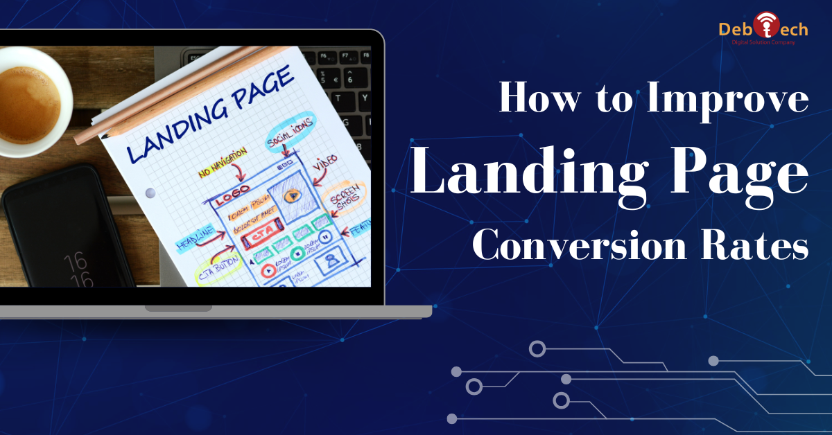
How to Improve Landing Page Conversion Rates
A landing page can receive plenty of paid traffic and still fail to produce qualified leads. The problem is rarely one isolated design choice. It is usually a mismatch between the promise in the ad, the visitor’s immediate question, and the action the page asks them to take. Knowing how to improve landing page conversion starts with fixing that chain, not adding more visual effects or rewriting a button at random.
For a local service business, SaaS company, or growth-stage team, every click has a cost. A landing page should make the next step obvious, credible, and low-friction. It should also help your sales team receive better inquiries instead of a larger volume of poor-fit submissions.
Start With the Conversion Goal, Not the Layout
A landing page cannot convert well when it tries to achieve five different goals at once. Decide what a successful visit means before discussing colors, sections, or form fields. Is the page designed to generate a strategy call, request a quote, book a demo, download a resource, or begin an application?
The answer affects every part of the page. A high-consideration B2B service may need a consultation request supported by proof of expertise and a clear explanation of the process. A time-sensitive local service campaign may need a prominent call button, service-area clarity, and reassurance that the business will respond quickly.
Define the primary conversion and track it accurately. Then identify supporting actions, such as phone calls, calendar bookings, chat starts, or form submissions. If paid ads, SEO, and email campaigns all send visitors to the same page, tag each source so you can see which channels drive qualified opportunities rather than just form completions.
Match the Message to Visitor Intent
The headline is not a branding exercise. It is the visitor’s first confirmation that they have arrived in the right place. It should connect directly to the search query, ad message, referral source, or campaign offer that brought them there.
Generic headlines such as “Solutions Built for Your Success” force visitors to do too much interpretation. A stronger headline states the outcome, audience, or service in plain language. For example, a company promoting commercial web development should explain what it builds and why that matters to the buyer’s business results.
Keep the message consistent from click to page. If a paid search ad promises a mobile-first website built to generate leads, the landing page should lead with that same value. Do not send users from a specific campaign promise to a broad homepage-style page packed with unrelated services.
The most effective pages also acknowledge the buyer’s concern. Decision-makers may worry about wasted ad spend, slow websites, low-quality leads, unclear reporting, or disconnected vendors. Address the relevant concern early, then show how your approach removes that risk.
Make the First Screen Earn the Next Scroll
Visitors should understand four things without hunting through the page: what you offer, who it is for, why it is valuable, and what they should do next. This is especially important on mobile, where screen space is limited and attention is short.
Use a clear headline, a concise supporting statement, and one primary call to action. A relevant image, product interface, or real project visual can reinforce the message, but it should not compete with it. Stock imagery is not automatically harmful, yet it often adds no evidence and can make a specialized service feel interchangeable.
Your call to action should describe the outcome where possible. “Request Your Website Growth Audit” provides more context than “Submit.” “Schedule a Strategy Call” sets a clearer expectation than “Learn More.” The right wording depends on the commitment required, but ambiguity almost always reduces action.
Avoid placing equal emphasis on competing choices. When visitors see multiple buttons, navigation paths, pop-ups, and offers before they understand the page, they are more likely to leave. A landing page needs purposeful focus, not the full menu of your business.
Build Trust Before Asking for Commitment
Most landing page visitors do not know your business well enough to act on a claim alone. They look for signals that you understand their needs and can deliver what you promise. Trust is a conversion requirement, particularly for professional services, enterprise projects, and campaigns involving personal or business information.
Use evidence that is specific and relevant to the offer. Case-study outcomes, client testimonials, recognizable client categories, certifications, years of experience, project examples, and clear process details can all help. The key is relevance. A testimonial about social media results does little for a visitor evaluating a website development campaign.
Social proof should answer practical questions: Did the provider work with a business like mine? Did they solve a real problem? Was the process dependable? Were the results measurable? Vague praise such as “great team” is positive but weak. Specific proof carries more commercial weight.
For businesses serving Northern Virginia and the DC metro area, local relevance can also reduce uncertainty. Mentioning real familiarity with regional markets, competitive search conditions, or service-area needs can help when that knowledge directly supports the campaign. It should not be added as filler to every page.
Remove Friction From Forms and Mobile Experience
A landing page that looks good on a desktop monitor can still lose most of its potential on a phone. Mobile visitors may be responding to an ad while commuting, comparing options between meetings, or looking for a fast answer. They will not tolerate slow load times, tiny text, difficult fields, or buttons that are hard to tap.
Review the page on actual mobile devices, not only in a browser preview. Check how quickly the key message appears, whether the call to action stays visible when appropriate, and whether the form can be completed without zooming or unnecessary typing.
Ask only for information your team will use at this stage. Long forms can improve lead qualification, but they can also reduce submission volume. The right balance depends on your sales process. If speed-to-contact is strong, a shorter form may perform better. If the service requires detailed scoping, a few qualifying questions may save your team from unproductive follow-up.
Do not overlook technical friction. Compress oversized media, limit scripts that slow rendering, and make sure confirmation pages or messages give users a clear next step. A form submission that disappears into uncertainty can create doubt before your team has the chance to respond.
Test the Elements That Affect Buying Decisions
Testing is how to improve landing page conversion without relying on opinions from the loudest person in the room. But not every change deserves a test. Start with elements that influence the visitor’s understanding, confidence, or effort.
Prioritize tests around the following areas:
- The headline and supporting value proposition
- The primary call to action and its placement
- Form length and qualifying questions
- Trust proof, including testimonials and results
- Page speed, mobile layout, and visual hierarchy
Test one meaningful variable at a time when traffic volume allows. Changing the headline, offer, form, and design simultaneously may produce an uplift, but it will not tell you why performance changed. If traffic is limited, use qualitative evidence alongside conversion data. Session recordings, heat maps, sales-call feedback, and form abandonment patterns can reveal problems that raw conversion rate alone cannot explain.
A higher conversion rate is not always a better outcome. A page that makes the form easier may produce more leads but fewer qualified sales conversations. Evaluate performance against lead quality, close rate, revenue potential, and campaign cost. This is where integrated execution matters: landing pages, paid media, analytics, and sales follow-up should inform each other.
Keep Improving After Launch
Launching a landing page is the beginning of optimization, not the finish line. Search terms shift, competitors change their offers, ad platforms evolve, and customer objections become clearer over time. The best-performing pages are maintained as active sales assets.
Review performance on a regular schedule. Look for high traffic with low engagement, strong form starts with poor completion, mobile conversion gaps, and sources that generate leads your team cannot close. Then make a focused improvement, measure the result, and retain what works.
Debtech approaches landing pages as part of a connected growth system, where website performance, campaign targeting, search visibility, and conversion tracking work together. That perspective prevents a common mistake: treating a low conversion rate as a design problem when the real issue may be weak traffic targeting, an unclear offer, or a broken follow-up process.
The practical next move is simple: open your highest-traffic landing page on a phone and ask whether a first-time visitor can explain the offer, trust the business, and take the next step in under a minute. If not, you have a clear place to begin.