
ABA Therapy Website Design That Drives Inquiries
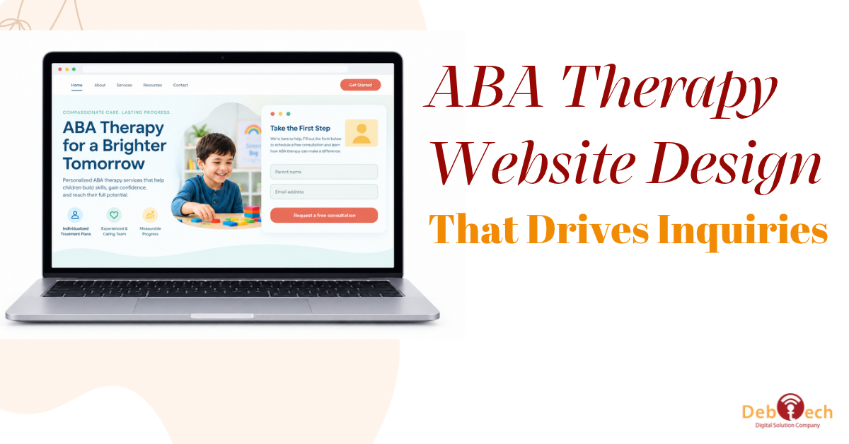
A parent searching for ABA services is rarely browsing casually. They may be comparing providers after a new diagnosis, trying to understand insurance, or looking for an appointment before a school deadline. ABA therapy website design has one job at that moment: reduce uncertainty and give that family a clear, credible next step.
A polished homepage is not enough. Your website needs to explain your services in plain language, work flawlessly on a phone, show why your practice is trustworthy, and turn qualified visitors into calls, forms, or intake requests. When those pieces are disconnected, your marketing spend and search traffic produce far less than they should.
What an ABA Therapy Website Must Accomplish
An ABA provider website serves several audiences at once. Parents and caregivers need reassurance and practical answers. Referral partners need to understand your service model and availability. Prospective staff want evidence that your organization is professional and well run. Each audience has different questions, but all of them judge your practice quickly.
The strongest websites organize information around decisions, not internal departments. A visitor should be able to determine whether you serve their child’s age group, whether services are available in their area, what settings you support, and how to begin. If key answers are buried in dense copy or a generic contact page, the site creates friction at the exact point it should be building confidence.
This is also where business goals matter. More traffic is not automatically better if visitors do not request an assessment, call the office, or submit a qualified inquiry. Conversion-focused design connects each page to a measurable action and gives your team visibility into what is producing leads.
Build Trust Before Asking for a Call
Families are evaluating far more than colors, layouts, and logos. They are looking for signals that your practice understands their situation and can guide them through a process that may feel overwhelming. Your site should make those signals visible without resorting to vague promises.
Start with clear service explanations. Describe the programs you offer, the ages you support, the environments where therapy occurs, and what parents can expect during the intake process. Use everyday language first, then provide clinical detail where it helps. A caregiver should not need to understand industry terminology to know whether your practice is a fit.
Credentials, clinician bios, service-area details, and a straightforward explanation of your approach can reinforce credibility. So can carefully written parent resources and a transparent description of how your team communicates with families. The goal is not to overload every page with proof. It is to answer the concerns that prevent a visitor from taking action.
Privacy deserves the same level of attention. Forms should request only the information needed to begin a conversation, and the site should clearly set expectations for how inquiries are handled. Do not make prospective families share a long clinical history before they can ask a basic question.
Make the First Step Easy on Mobile
Many ABA searches happen on a smartphone between appointments, school pickup, work, and family responsibilities. If your navigation is hard to use, your phone number is not tappable, or your intake form is frustrating on a small screen, you are losing opportunities that may never return.
Mobile-first design means more than shrinking a desktop layout. It means prioritizing the information and actions a caregiver needs most. A prominent call button, a short inquiry path, readable text, and pages that load quickly create a better experience and support stronger conversion rates.
Your primary call to action should match the readiness of the visitor. “Request an assessment” may work well for a family that understands what they need. Others may need a lower-pressure option such as “Talk with our intake team” or “Check service availability.” The right choice depends on your operational process and the capacity of your team to follow up.
A website cannot compensate for delayed responses. If the site generates inquiries but families wait days for a reply, conversion drops after the form is submitted. Design, intake operations, and marketing accountability need to work as one system.
Use Service Pages to Capture High-Intent Searches
A single general services page rarely gives search engines or families enough context. Dedicated pages for the services and locations you actually support create stronger relevance and make it easier for visitors to find the right information.
For example, a page about in-home ABA should address what that setting involves, who it may serve, and how a family can start. A center-based program page should explain the environment and the next step for scheduling. Location pages should be genuinely useful, not copied text with a city name swapped out. Include local service details, practical coverage information, and a clear path to contact the office.
This approach supports local SEO while improving the visitor experience. It also creates better landing pages for paid search campaigns. Sending every ad click to the homepage forces families to hunt for answers. Sending them to a page that directly reflects their search intent gives the campaign a better chance to produce qualified leads.
Design for Clarity, Not Distraction
ABA therapy websites often fall into one of two traps. Some feel overly clinical, using dense language and sterile visuals that make the experience impersonal. Others lean so heavily on playful graphics that the practice feels less established than it is. The right balance depends on your brand, but clarity should lead every design decision.
Use visual hierarchy to guide visitors from the main question to the next action. Give pages room to breathe. Keep navigation simple. Avoid sliders, pop-ups, and competing calls to action that distract from an inquiry. Real photography can add warmth when it is used thoughtfully and with appropriate permissions, but stock imagery alone should not carry the trust burden.
Accessibility also belongs in the design plan. Sufficient color contrast, legible font sizes, descriptive labels, keyboard-friendly navigation, and clear form errors help more people use the site effectively. These choices improve usability for everyone, not just visitors with a specific accessibility need.
Measure the Leads That Matter
A conversion-focused website should be managed with evidence, not assumptions. Track form submissions, phone calls, appointment requests, and other actions that indicate genuine intake interest. Then review which channels, pages, and campaigns are producing inquiries that your team can actually serve.
This is where integrated execution creates an advantage. SEO can show which searches bring in qualified traffic. Paid advertising can test specific services or markets. Landing pages can be refined based on behavior. Your website becomes the central system that turns visibility into measurable demand rather than a static brochure built once and forgotten.
Do not judge performance only by total leads. A sudden increase in inquiries may look positive while creating more work for intake staff with little increase in eligible families. The better question is whether the website is helping your practice attract the right inquiries, move families forward efficiently, and support sustainable growth.
A Better Standard for ABA Therapy Website Design
The best ABA therapy website design gives families a calm, direct path forward while giving your organization a dependable lead-generation asset. It should communicate competence without jargon, compassion without empty language, and next steps without friction.
Before approving a redesign, test one simple scenario: a parent finds your site on a phone and has two minutes to decide whether to contact you. Can they understand what you offer, see why they should trust you, and take action without searching for answers? If not, the opportunity is not a cosmetic refresh. It is a stronger digital system built to help the right families reach your team.